This is GISTEMP data starting from year 1880, which is 30 years after the end of Little Ice Age. The data set which deals with world temperatures comes from NASA: data.giss.nasa.gov/gistemp/.
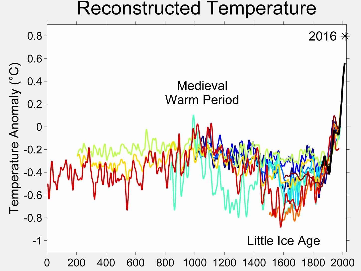
Above is a plot from only a reconstructed data. Instrumental global surface temperature record since widespread reliable measurements began in the late 19th century, but I included this plot to raise an interest about the global climate.
data_global <- read.csv("./data/ExcelFormattedGISTEMPDataCSV.csv",
                        header=T, sep=",",
                        na.strings = c("***","****"))

data_latitudes <- read.csv("./data/ExcelFormattedGISTEMPData2CSV.csv",
                           header=T, sep=",",
                           check.names=F)
# Here I'm reading information about temperature in particular months
data_global_reshaped <- gather(data_global[, !names(data_global)
                                           %in% c("J.D", "D.N",
                                                  "DJF", "MAM",
                                                  "JJA", "SON")],
                               month, temperature,
                               -Year)

# Than I'm loading all other attributes
data_global_reshaped_special <- gather(data_global[,c("Year", "J.D",
                                                      "D.N", "DJF",
                                                      "MAM", "JJA",
                                                      "SON")],
                                       property, value,
                                       -Year)

# This holds information about temperatures per latitudes
data_latitudes_reshaped <- gather(data_latitudes,
                                  latitude, temperature,
                                  -Year)
All temperatures are given in Fahrenheits
The upward “blip” in temps during WW2 seems to have primarily been due to changes in measurement methods occasioned by the war itself, though the “output” of war itself may have had some impact, too. Source: newscientist.com/article/dn14006-buckets-to-blame-for-wartime-temperature-blip.html.
Warning in hPlot(temperature ~ Year, group = "month", data =
data_global_reshaped, : Observations with NA has been removed
Warning in hPlot(value ~ Year, group = "property", data =
data_global_reshaped_special, : Observations with NA has been removed
Warning in hPlot(value ~ Year, group = "property", data =
data_global_reshaped_special, : Observations with NA has been removed
My goal is to show small fluctuations after year 1850 (which is when little ice age ended) and identify moments of colder years especially in the nothern hemisphere
bothhem <- data_latitudes_reshaped[
   data_latitudes_reshaped$latitude %in% c('NHem','SHem'),
   c("Year","latitude", "temperature")]
bothhem$latitude <- revalue(bothhem$latitude, c("NHem"="Northern Hemisphere"))
bothhem$latitude <- revalue(bothhem$latitude, c("SHem"="Southern Hemisphere"))

nhem <- data_latitudes_reshaped[
   data_latitudes_reshaped$latitude == 'NHem',
   c("Year","temperature")]

shem <- data_latitudes_reshaped[
   data_latitudes_reshaped$latitude == 'SHem',
   c("Year","temperature")]
I subseted the data to include only two groups, because I found out that trend was exactly the same for other groups, like months of the year, etc. There is also a deviation between Northern and Southern hemisphere in period 1920 - 1940, which I cannot explain at the moment. An opinion of a climatologist would be helpful.
2th August, 2015