![[Previous]](image-lib/prev.gif) |
![[Bookset]](image-lib/contents.gif) |
![[Next]](image-lib/next.gif) |
|
|
|
A scrolling list of text items
PtWidget --> PtBasic --> PtContainer --> PtCompound --> PtGenList --> PtList
For more information, see the diagram of the widget hierarchy.

<photon/PtList.h>
The PtList class displays a scrolling list of text items. You can select one or more items, depending on the selection policy.
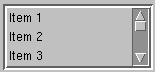
A PtList containing text items.
Lists are particularly useful for presenting a large or unknown number of textual items (e.g. a set of items changing over time). Lists have the added advantage of displaying the set of items currently selected, and allowing more than one item to be selected at once.
Lists have a few limitations:
If the number of items is too large to display in the area allocated to the list, the widget can display a vertical scrollbar. You can use the inherited Pt_ARG_LIST_FLAGS resource to control when the scrollbar appears: always, never, or as required.
To display items in columns, you can:
Or
With both methods, the Tab character is used in the item strings as a column separator.
 |
Even if you use columns, each line in the list remains a single item. When you select any part of the line, the entire line is selected - having columns doesn't make the list into a spreadsheet. |
The selection policy for the widget determines how the user will select choices from the list. Lists support the following selection policies:
A callback function notifies the application of selections. The callback function behaves in a different manner for each of the selection policies. See "Selection notification."
If you know the list of available choices when you create the list, you can specify it using the Pt_ARG_ITEMS resource. This resource takes an array of null-terminated strings.
You should establish the selection policy for the list when it's created. The resource that controls the selection policy is Pt_ARG_SEL_MODE.
The default selection policy is browse selection mode, which is the more user-friendly of the two selection modes that allow a single selection.
If the number of items in a widget is variable, or is known to be large, you should control the size of the widget by explicitly setting dimensions or limiting the number of items displayed.
If you ever need to get the items in a list, you can use some code like this:
PtArg_t args[1];
short *num, i;
char **items = NULL;

PtSetArg(&args[0], Pt_ARG_ITEMS, &items, &num);
PtGetResources(list_wgt, 1, args);

for (i = 0; i < *num; i++)
    printf("Item %d: %s\n", i, items[i]);
To control the number of visible items in the list widget, use the Pt_ARG_VISIBLE_COUNT resource. The number of visible items is the number of list items displayed in the list at any given time. If this number is less than the total number of items in the list, the list widget can add a vertical scroll bar so the user can scroll through the whole list.
|
The Pt_ARG_VISIBLE_COUNT resource is inherited from PtGenList but is used differently. For PtGenList, Pt_ARG_VISIBLE_COUNT is a read-only resource that tells you the number of visible items. For PtList, it's the number of items you want to display. |
If specified, the number of visible items will be used to calculate the dimensions of the list (if no explicit dimensions were given). If you give explicit dimensions of the widget, the number of visible items will be calculated based on those dimensions and the font metrics for the list font.
As we saw previously, the list widget will create a scroll bar if the list's area isn't large enough to display all the items in the list. By default, the scroll bar will be displayed only when necessary. This behavior is controlled by the Pt_LIST_SCROLLBAR_ALWAYS and (the default) Pt_LIST_SCROLLBAR_AS_REQUIRED flags in the Pt_ARG_LIST_FLAGS resource.
The list widget uses the Pt_CB_SELECTION callback to notify your application whenever the user has made a new selection. This cbdata passed to the callback always contains a pointer to a PtListCallback_t structure. The selection policy in effect on the widget at the time of the callback determines which members of the structure are valid.
The mode member of the callback data structure contains the selection mode that caused the callback to be invoked. This member should be consulted to determine how to handle the callback.
Single selection and browse selection modes allow only a single selection to be made. In browse mode, the selection isn't made until the user releases the pointer button after having dragged the pointer over the list items.
In either case, the selection callback is invoked when the selection is made. The single selected item is identified in the call data.
Three members of the callback data structure identify the item that was selected:
Multiple selection modes, including extended selection, allow several items to be selected at once. When the selection callback is invoked, more than one item may have been added to the set of selected items. The call data passed to the callback function includes the complete set of selected items.
The set of selected items is provided by these members:
Each index in the array refers to the original array of items maintained by the Pt_ARG_ITEMS resource.
Mouse actions depend on the current selection mode.
| Button action | Result |
|---|---|
| Press | Result depends on the value of Pt_ARG_SELECTION_MODE. |
| Release | Invokes callbacks. |
Keyboard actions depend on the current selection mode.
| Key | Action |
|---|---|
| Enter | Result depends on value of Pt_ARG_SELECTION_MODE. |
| /\ | Previous item |
| \/ | Next item |
| Pg Up | Previous page |
| Pg Dn | Next page |
| Home | First item |
| End | Last item |
| Resource | C type | Pt type | Default |
|---|---|---|---|
| Pt_ARG_ITEMS | char **, short | Array | NULL |
| Pt_ARG_LIST_BALLOON | PtListBalloonF_t * | Pointer | See below |
| Pt_ARG_LIST_SPACING | short | Scalar | 0 |
| Pt_ARG_MODIFY_ITEMS | PtListModifyItems_t | Struct | |
| Pt_ARG_SELECTION_INDEXES | unsigned short *, short | Array | NULL |
| Pt_CB_LIST_INPUT | PtCallback_t * | Link | NULL |
| Pt_CB_SELECTION | PtCallback_t * | Link | NULL |
| C type | Pt type | Default |
|---|---|---|
| char **, short | Array | NULL |
An array of pointers to text items to be displayed in the list.
| C type | Pt type | Default |
|---|---|---|
| PtListBalloonF_t * | Pointer | See below |
A function that inflates a balloon for the item the pointer is on. PtListBalloonF_t is a function type:
typedef PtWidget_t *PtListBalloonF_t(
    PtWidget_t *widget, PtWidget_t *parent,
    PhArea_t *area, PtListColumn_t const *col,
    int coln, const char *item,
    unsigned index, const char *font);
The parameters are as follows:
The default function does this:
return
    PtGenListCreateTextBalloon(
      widget, parent,
      PtGenListSetColumnBalloon ( area, col ),
      item, coln, font);
| C type | Pt type | Default |
|---|---|---|
| short | Scalar | 0 |
The spacing between the items in the list.
| C type | Pt type | Default |
|---|---|---|
| PtListModifyItems_t | Struct |
Used internally by the convenience functions.
| C type | Pt type | Default |
|---|---|---|
| unsigned short *, short | Array | NULL |
An array of indexes indicating which list items given by the Pt_ARG_ITEMS array are currently selected.
| C type | Pt type | Default |
|---|---|---|
| PtCallback_t * | Link | NULL |
A list of callbacks that the widget invokes on each mouse and key event. Each callback is passed a PtCallbackInfo_t structure that contains at least the following members:
These callbacks should return Pt_CONTINUE.
| C type | Pt type | Default |
|---|---|---|
| PtCallback_t * | Link | NULL |
A list of callbacks that the widget invokes whenever the user selects an item from the list. Each callback is passed a PtCallbackInfo_t structure that contains at least the following members:
These callbacks should return Pt_CONTINUE.
If the widget modifies an inherited resource, the "Default override" column indicates the new value. This modification affects any subclasses of the widget.
The PtList widget defines several convenience functions that make it easier to use the list once it's been created. Here's a brief overview:
|
|
|